Hero Image Credit: Landini Associates – Felna Supermaket, Japan
The art of stripping back in retail design.
In the ever-evolving world of retail design, simplicity often speaks volumes and adopting a minimalist approach can be incredibly effective. The concept of stripping back a space involves decluttering and simplifying the overall design to highlight key focal points. It’s about creating an environment where every element serves a purpose and contributes to a cohesive narrative. As we embrace the spirit of spring, we apply this principle to create an inviting and streamlined retail space. Here is how to achieve it.
Designing clear pathways and destinations for enhanced shopping journeys.
One of the key strategies we employ in our retail design projects is the creation of clear destinations within the store. By establishing distinct zones, each with its unique purpose, retailers can guide customers seamlessly through the shopping journey. This not only enhances the overall flow of the space but also allows for a more tailored and immersive customer experience.
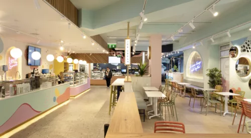
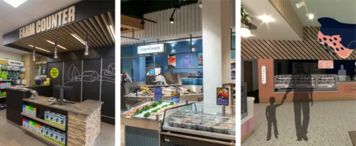
For Kavanagh’s store design, increasing the ceiling height and integrating pillars into the store design allowed the space to be opened up to create zones for different types of customer journeys. With the creation of a food-to-go island at the front of the supermarket for convenience shoppers and a delicatessen, fishmonger and cheese counter at the back of the store for customers with longer dwelling times. The impact was not only seen in increased sales but also in positive customer feedback. Shoppers appreciated the ease of navigation and the curated experience, resulting in longer dwell times.
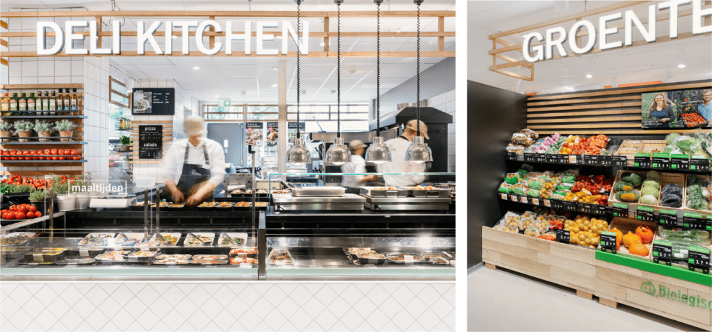
The impact of creating distinct destinations with a store can clearly be seen in Albert Heijn, in the Netherlands, where clear areas within a small store allow for the ease of convenience store shopping while the offering to customers is more of a supermarket experience.
Optimising customer experience through store design.
A thoughtfully designed space can elevate the customer experience, making it more enjoyable and memorable. When a store is cluttered and lacks clear direction, it can be overwhelming for customers, leading to frustration and a disjointed experience. In contrast, a well-defined layout with clear pathways and considered communication
enhances navigation and encourages exploration.
Felna, the Japanese grocery store has a functional, refined and elegant design that enhances its fresh, quality food offering. Free from any visual clutter with a minimal colour palette and material choices the design has a timeless appeal, which adds to the customer experience.
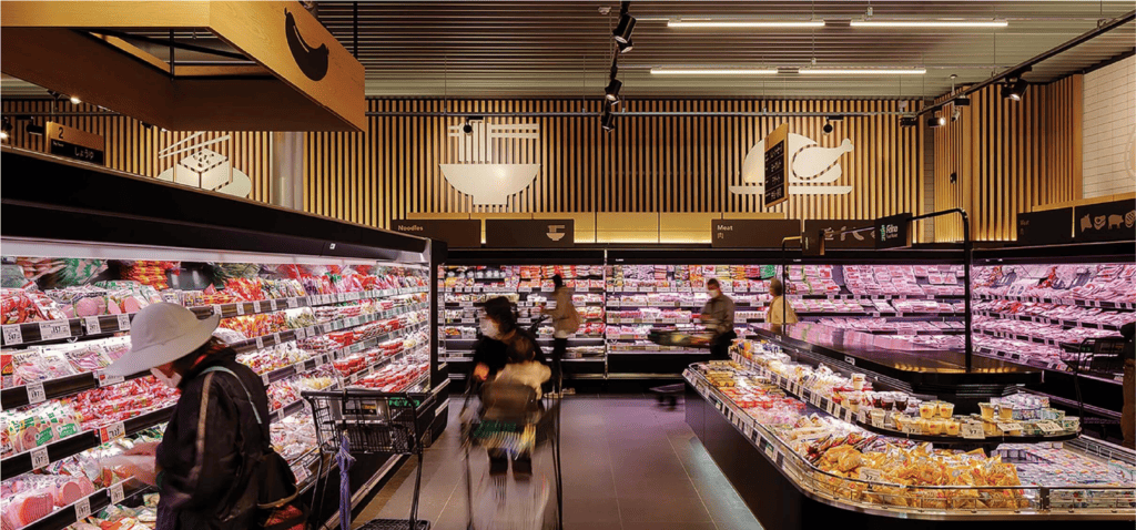
Image Credit: Landini Associates – Felna Supermaket, Japan
Visual merchandising as a tool to drive sales.
Spring is the perfect time to reassess and revamp visual merchandising strategies. By strategically placing products in designated areas, retailers can highlight seasonal
collections, new arrivals, or themed displays. This not only adds a fresh, dynamic element to the store but also guides customers towards specific products or sections,
increasing the likelihood of making a purchase.
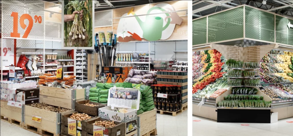
ICA Maxi in Sweden is a supermarket with sustainability and value as their key differentiators. The display units are simple and functional, however, the scale of the signage and arrangement displays are used to emphasise the value on offer and add a dynamic element to the overall store design.
Creating impactful focal points in store design.
In a stripped-back retail environment, focal points become crucial in capturing customers’ attention. When looking at the overall store design, it is important to consider strategically placed displays, moments of brand communication and storytelling, and including areas for carefully curated product showcases. By thoughtfully positioning these focal points, retailers can guide the customer’s gaze and create a visual hierarchy that reinforces the brand’s message and identity.
Adapting retail design for flexibility.
Spring is a season of change, and retail design should allow for flexibility to adapt to seasonal offerings and reflect changes in customer behaviour. A well-designed store should be flexible enough to accommodate different promotions and evolving product lines. This flexibility not only keeps the space dynamic but also allows retailers to respond swiftly to market trends and customer preferences.
A thoughtful spring refresh can breathe new life into supermarket environments. By stripping back a store’s design and creating clear destinations, retailers can positively impact the overall customer experience. At Rigney Forge, we believe in the transformative power of store design, and we invite you to explore the possibilities of enhancing your retail space this season. Whether that is decluttering a section of your store, focusing on consistence brand messaging or a full re-design, the store environment should not only captivate the senses but also leave a lasting impression on every customer who walks through your doors.
